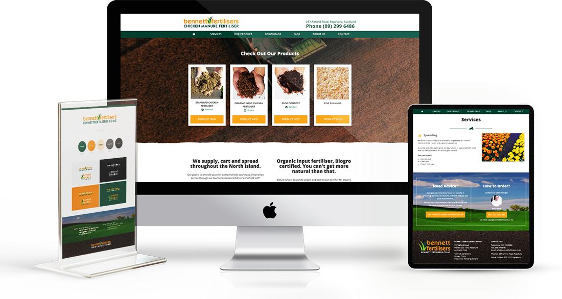
Bennett Fertilisers was looking for an impactful brand identity which would keep pace amongst their larger agri-industry peers, look great across their vehicle fleet and translate smoothly to flyers, brochures and online.
Focusing on the outcome/benefits of using organic chicken manure, we settled on iconography which depicted lush grass and ultimately growth. For the typography we chose an accessible open feeling font paired with two differing bi-lines and several different configurations (to be used depending on the needs of the media). To complete a well rounded colour pallet, we paired a warm orange colour in contrast to the greens, ensuring high impact and imparting energy into the overall identity.
After working through vehicle signage and print collateral, we applied the brand guidelines to a clear and easy-to-use Drupal website, with an emphasis on mobile friendly (recognising that customers are just as likely to be literally in the field than behind a desk).
Clear product information and easily accessed "calls to action" help drive business and keep the Bennett Fertilisers site relevant in a competitive market.

